

Pure Practice
A B2C mobile application for yogis of all experience levels
Role: Sole UX/UI Designer
Timeline: 3 months
Tools: Figma, Miro, Google Docs
Pure Practice is a B2C mobile application created to provide information on the different yoga styles and access to a variety of classes. The app also offers a style quiz, equipment, and the opportunity to connect with the community. As the sole UX/UI designer for this project, I determined my users' pain points by conducting interviews, and the creation of affinity maps, empathy maps, and personas. I referenced this data throughout the design process to keep the user's needs a priority throughout multiple iterations.
Overview
Problem
Achieving Consistency in Yoga Practice is Often Challenging
There are many different styles of yoga and the amount of information can seem endless. Discovering your ideal yoga style and finding instructors and equipment can all cause individuals to become overwhelmed and discourage them from continuing or beginning their practice.
A Platform Offering Yoga Classes, Resources, and Equipment to Practitioners of All Levels
Solution
Pure Practice provides classes and organizes information to make it accessible to yogis of all experience levels. The app provides a quiz to deiscern the branch of yoga best suited for them and access to yoga style information, instructors, and equipment in one easy-to-use platform.


Many People Avoid Yoga Due To Widespread Misconceptions About the Physical Requirements
Research
There are many misconceptions about what is needed to be a successful yogi. My research showed that attributes such as weight, flexibility, strength, age, and gender played a major role when individuals decided if practicing yoga was a good fit for them. For example, yoga practitioners are overwhelmingly female and outnumber men 5:1. Many people also believe that you must be strong, thin, flexible, young, or spiritual to be an ideal candidate for yoga. Yoga can be beneficial for all people regardless of gender, body type, or age and many are missing out on the benefits due to the spread of misinformation.
Gathering Interview Participants: Who Are The Users?
Participants for the screener survey were recruited by word of mouth within the NYC yoga community as well as social media platforms Facebook and Instagram. Out of the 20 responses, five participants who matched the criteria below were chosen for interviews:
Individuals with little/no yoga experience
Experienced difficulties when beginning their practice
Wanted to begin or improve their yoga experience
Interested in improving their mental/physical health
The 5 selected participants were interviewed and provided much-needed insight into the challenges faced when first becoming acquainted with a consistent yoga practice. Taking note of the participant’s opinions and pain points the problem I wanted to solve with Pure Practice became clear.
Affinity and Empathy Maps
Gathering Insight Into Users Thoughts and Feelings
Organizing and clustering the information collected from the five interviews revealed six underlying themes: Benefits, Pain Points, Practitioner Characteristics, Location, Misconceptions, and Gender. The two empathy maps showed two types of users, experienced and no/little experience. Thinking from these POVs allowed me to make assumptions about their emotions, wants, and needs.

Affinity Map

Empathy Map
The Experienced vs Inexperienced Yogi
Personas
Using the information I gathered from my interviews, affinity map, and empathy maps I identified two personas:
Bella the consistent yogi
Lily the novice
The goal was to create two realistic users to empathize and connect with as well as use them to refer back to while ideating to not lose focus on who I was designing for.


Personas
My user stories organized and prioritized the content that I wanted to provide to the users. When creating wireframes I referenced the user stories to decide the hierarchy of the content. My high-priority user flows were as follows:
As a yogi, I want to find affordable classes, so that I can practice more consistently
As a yogi, I want to be able to easily decide which type of yoga is best for me so I can enroll in the right classes
As a yogi, I want to find classes that provide pose modifications so that I can comfortably practice yoga
As a yogi, I want easier access to the yoga community, so that I can connect and learn/be supported by other yogis
As a yogi, I want access to free yoga classes, so that I can practice without causing myself financial stress
As a yogi, I want an easy, quick process to create an account, so that I can access all my yoga information in one place
User Stories
Site Map
Creating the Blueprint: Prioritizing and Organizing Content
Creating a visual map of the information I wanted to include ensured that I was including all relevant information without overwhelming my users. My site map also provided a tentative structure for the hierarchy of my screens.
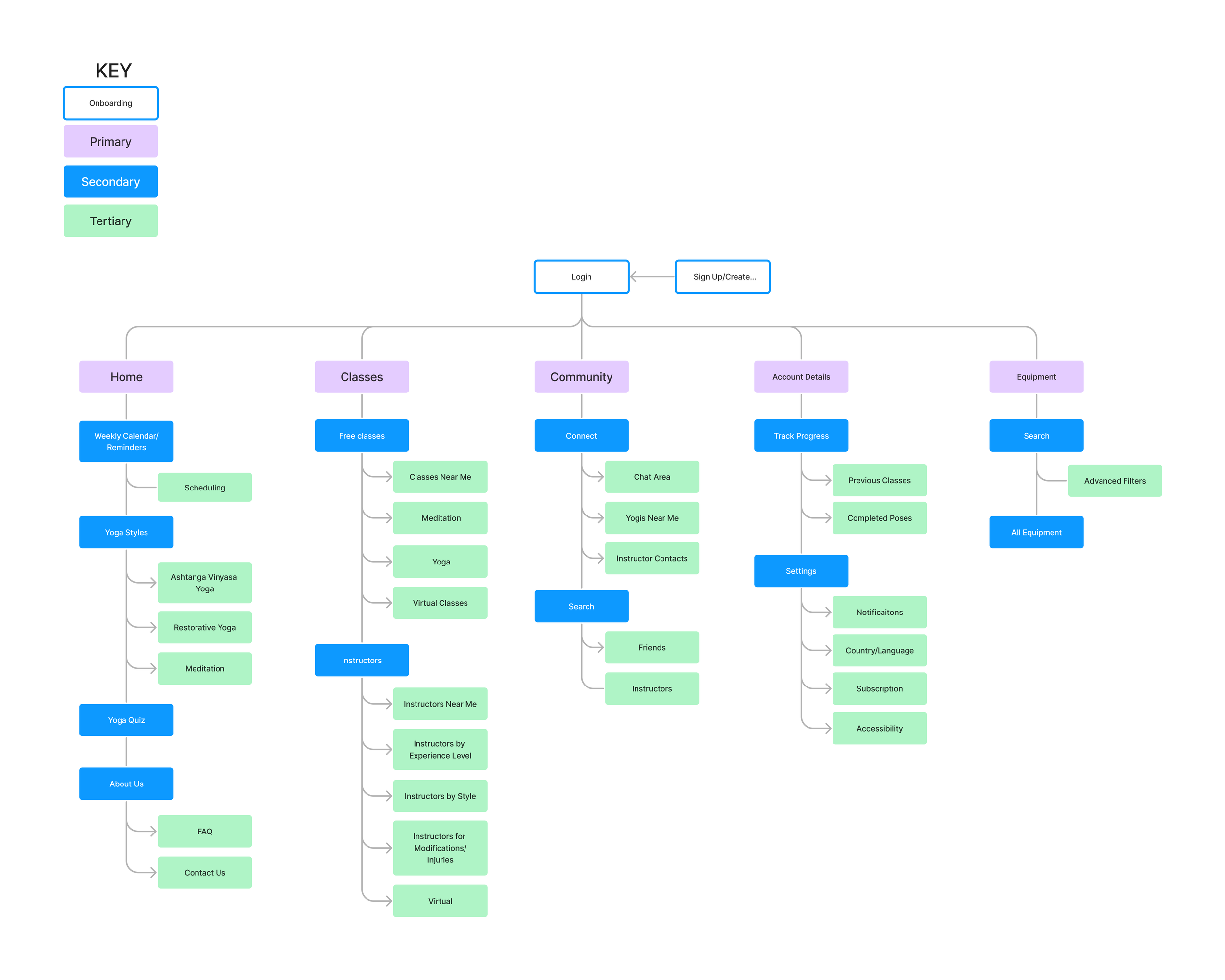
Site Map
Which content will users frequently engage with?
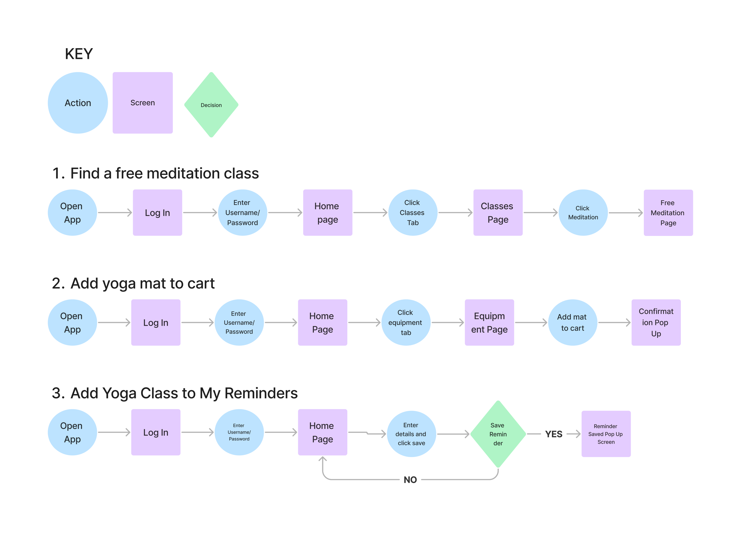
User Flows
I constructed 3 user flows using circles, squares, and diamonds to indicate actions, screens, and decisions. The goal was to ensure that I created an accessible and direct path from beginning to end. I decided upon these user flows, because I believed that these would be the most highly trafficked red routes and would use these flows during the testing of the prototype..
Find a free meditation class
Add yoga mat to cart
Add yoga class to my reminders
User Flows
I began my designs with sketches and wireframes so I could begin to make layout decisions without wasting time making them visually appealing. These low-fidelity screens allowed me to see how my designs would translate to my users with minimum detail.
Sketches and Wireframes

Sketches


Moodboard
What Design Aspects Will Evoke Calm Positive Feelings In My Users?
The moodboard I created provided me with inspiration for my style guide and allowed me to explore the UI elements of other similar successful apps. I collected various images and created a color palette that conveyed feelings of calm, peace, and serenity. I chose the name Pure Practice based on the visuals and emotions displayed on my moodboard. I wanted every aspect of the app to be simple, clean, and polished.

Moodboard
The colorography and iconography in my style guide were inspired by the calming images and color palette from my moodboard.
Style Guide

Style Guide
I designed my high hi-fi screens to create a layout that displayed the calming emotions presented in my moldboard. Since the app is about yoga and meditation making sure navigating the app wasn't overwhelming or stressful for the user was a priority. During my iterations, I made updates to the color palette, typography as well as the layout of the equipment and reminder screens. Using the final high-fidelity screens I created a prototype to conduct moderated interviews asking participants to attempt to complete my chosen user stories.
High Fidelity Screens and Prototype


I conducted usability testing by conducting interviews with five participants through a moderated remote Zoom session. I requested the participants attempt to complete the three user stories while I observed, took notes, and asked follow-up questions. Issues surfaced during usability testing indicating a need for updates. I organized these updates by severity, brainstormed solutions, and made the necessary changes so the final product was the functional and accessible app I intended.
Usability Testing

Screenshot of Usability Testing
Resolving User Confusion and Improving Accessibility with Updated UX Writing and Additional Content
Redesign
The results of the usability testing highlighted several areas where improvements could be made to improve accessibility. Referencing the chart from my user testing report I began by addressing the most critical issues first. The changes made are as follows:
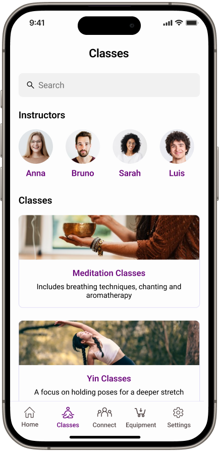
Adding A Spotlight Class To Homepage
User testing participants observed that one of Pure Practice's main objectives is to offer yoga classes therefore they should have direct access to them. I addressed this by incorporating a spotlight class directly below the section on yoga styles.
The initial design of the Yoga Style cards failed to encourage users to scroll through the carousel, resulting in a significant amount of content being overlooked. To address this, I redesigned the card sizes to clearly extend beyond the frame, prompting users to scroll and explore additional styles.
Revamping Card Carousel

Additional Text and Content to Provide Clarification
During usability testing, participants were confused about certain content, such as the purpose of reminders on the Add Reminders screen and the function of Yoga Styles cards. To clarify, I added subtext beneath Yoga Styles, and I redesigned the reminders screen to include subcategories for personalized reminders.


Conclusion
The process of creating Pure Practice was an incredible learning experience from beginning to end. During the research portion, I discovered how critical it was to ignore my knowledge, experiences, and opinions about yoga. Once doing so, I realized without having gathered information on my user's point of view, my platform would have been missing components crucial to its success.
Prioritizing functionality over beautification during the design process was difficult at first because it was important the UI conveyed a calm, peaceful feeling. Over multiple iterations, I created a functional yet visually appealing app that satisfied both myself and my users. User testing of the prototype was essential, without the information gathered from potential users, I would have been unable to pinpoint the necessary enhancements needed to improve functionality. Being the sole designer for Pure Practice showed me the importance of each step in the design process.