
Najaa
A B2B2C mobile application designed to provide those who suffer from pornography addiction access to recovery tools and support

Role: UX/UI Designer
Timeline: 3 months
Tools: Figma, Slack, Google Drive
Najaa is a B2B2C mobile application designed to provide those who suffer from pornography addiction access to the tools needed for recovery. The platform offers courses, progress tracking, and a blocking feature to remove access to triggering content. Najaa also considered their users' need for emotional support and included access to course mentors, therapists, and supportive friends and family.
Overview
How Can We Minimize Relapse Among Individuals Battling Pornography Addiction?
Problem
Recovering from addiction is a life-long challenge and those who suffer from pornography addiction often suffer in silence. Many recovering addicts refrain from seeking help due to discomfort in disclosing their condition, fearing judgment, or they have difficulty finding the resources needed for their recovery.
A Step-By-Step Recovery Plan and Support From Coaches and Mental Health Professionals.
Solution
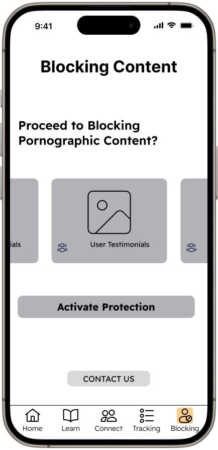
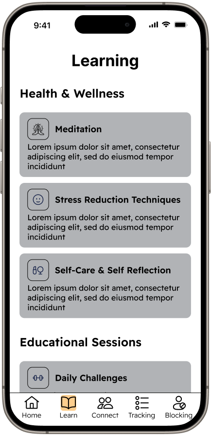
By providing mobile access to courses and a support system users can work on their recovery at anytime. Najaa includes access to classes, meditations, therapists, coaches, and a dedicated area for tracking and journaling progress. Users also have the option to block content and provide friends/family access to this feature to assist them in their recovery.


Getting Started
Najaa: A Different Approach to Addiction Recovery
We initiated the project by meeting via Zoom to examine the materials provided by the client and discuss the project scope. The client emphasized that what sets Najaa apart is its balanced blend of recovery content and emotional and mental support. Following the review of Najaa’s style guide, brand platform, and project brief we crafted some client questions to gather additional information. Our findings were as follows:
Najaa differentiates itself from competitors by taking a holistic approach to addiction recovery.
The client wanted to include courses, emotional support, and blocking services.
Pornography addiction is a behavioral challenge that requires both prevention and support simultaneously.
Market Competition: Identifying Strengths and Weaknesses
Competitive Analysis
I assisted my team in creating a chart to evaluate our competitive analysis findings. The client provided three mobile applications he regarded as Najaa's primary competition: Fortify, Brain Buddy, and Remojo. This was the final analysis:
All competitors' mobile applications provided tracking features for users to view past progress.
All three applications were missing one of the following: Blocking, Daily Goals, Connect with Friend/Therapist/Coach.
Two out of three applications provided a free version, but all required additional payment for access to all features.
All applications included visual aids when viewing progress such as pie charts, line graphs, or histograms.

Screenshot of Competitive Analysis
The client provided the following user stories:
As a user, I want to create an account and log in
a) as an individual user
b) as a family (family can only access the blocking feature)
As a user, I want to see my dashboard upon login
a) Home
b) Learn
c) Connect
d) Tracking
e) Blocking
As a user, I want to access the home feature
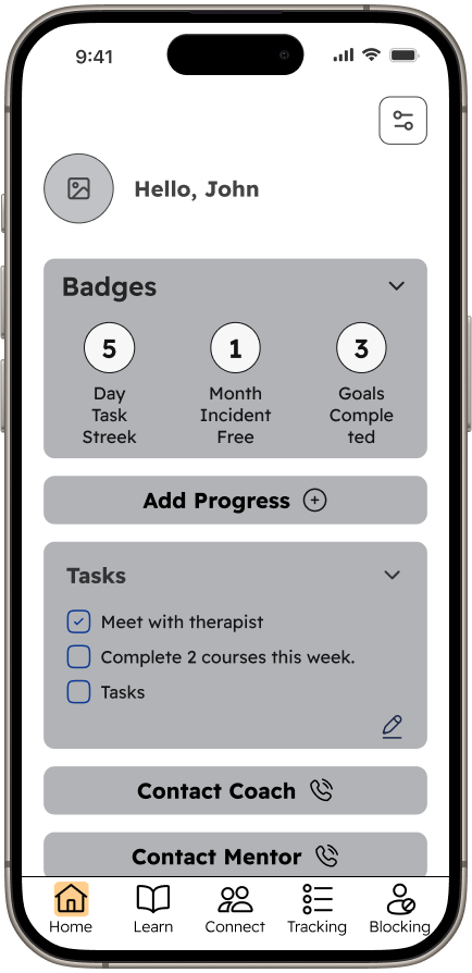
a) As a user, I want to access and edit my profile from home (view my name, avatar, and badges earned)
b) As a user, I want to create, access, and edit tasks/goals from home (interact with my tasks and goals)
c) As a user, I want to be able to update my progress for the day: Victory or Setback
d) As a user, I want to be able to reach out to a coach or mentor
User Stories
Wireframe Preparation: Keeping flows clear and concise for maximum efficiency
User Flows
My team collaborated to create user flows for the client's user stories. By building out these flows we discerned the amount of screens needed to start our design and map out the most efficient route for users to complete a task, guaranteeing a seamless user experience. When designing the user flows, I kept in mind the client's wish for simplicity, ensuring clear and concise navigation by minimizing the number of clicks necessary for users to reach their destination.
3C: As a user, I want to be able to update my progress for the day Victory or Setback
3D: As a user, I want to be able to reach out to a coach or mentor

User Flows 3C and 3D
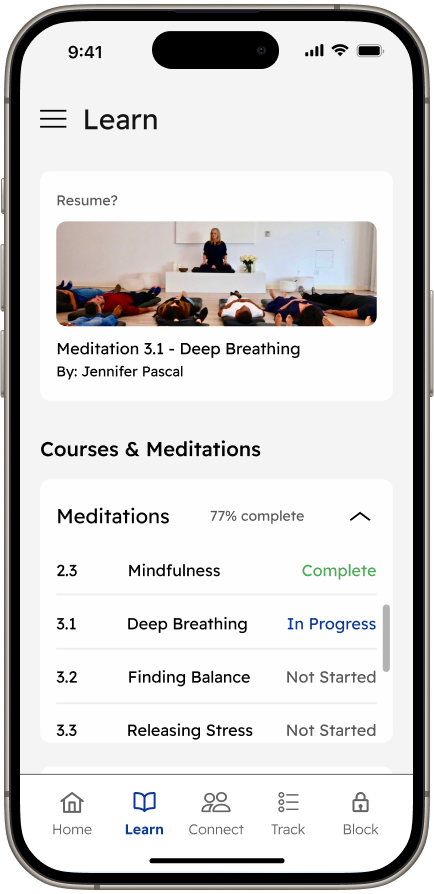
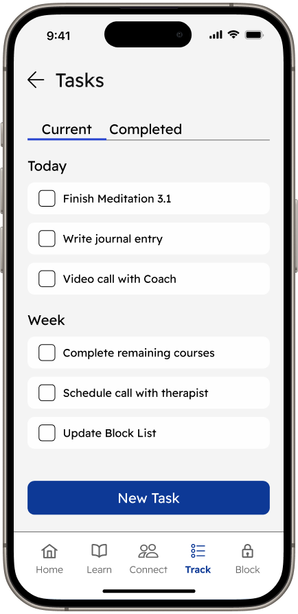
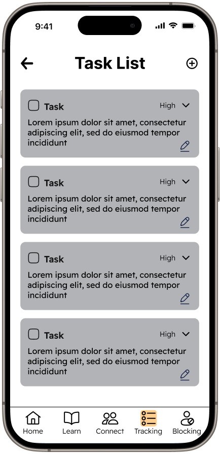
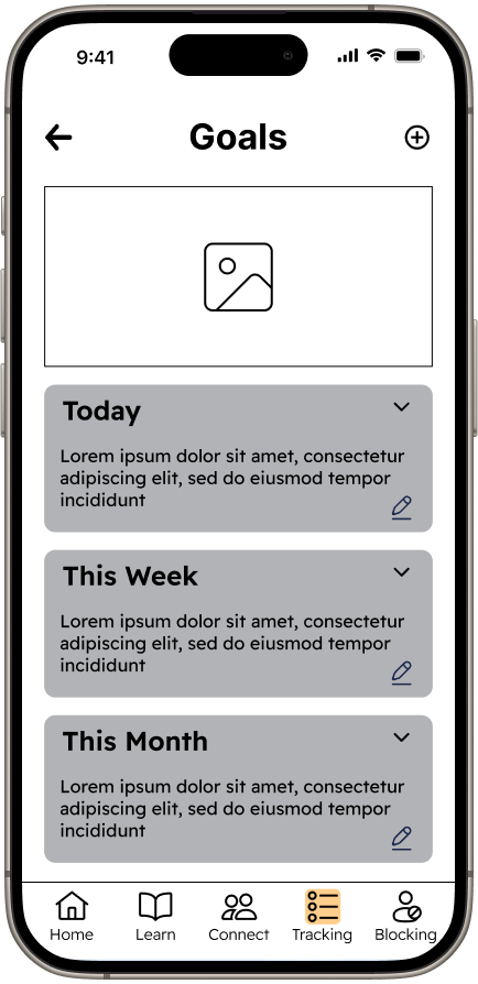
Each designer created wireframes for their assigned user flows, with my focus on the Tracking screen and its modules. I included a monthly calendar for users to easily view their progress and text input in the pop-up modules to make note of what led to the day's victory or setback. Our team met on Figma for peer reviews and group edits to ensure consistency and flow between screens. Throughout this process, we concluded that access to tasks, goals, and support should be prioritized and added shortcuts to the home screen for the user’s convenience.
Wireframes


Exploring UI Designs in Track/Goal-Oriented Apps
Inspiration
Prior to creating our high-fidelity mock-ups, our team examined the designs of Najaa's competitors in the addiction recovery market, as well as applications focusing on data tracking or course provision. Our analysis of these applications provided insight into the common key components shared by successful applications.
Below are the key takeaways from our research:
A calendar is essential for data-tracking applications.
Many applications use vivid illustrations to catch and hold the users' attention.
UI Designs were clean and incorporated color only when necessary.
The use of cards provided an organized way to display different categories of information to users.
UI Iterations
Differences in UI: Layout, Dark Mode, Typography and Colorography
Three designers built a version of the home screen to allow the client to choose which UI design best fit their vision for the final product. When creating my home screen iteration I referenced Najaa’s brand platform, style guide, and best practices. My screen (UI Iteration #2) included the following:
A muted yellow to replace the original primary color to prevent overstimulating and distracting users.
An option to resume an incomplete course or meditation session.
A hamburger menu for easy access to user profile, settings, and additional navigation.

Home Screen Iterations
Style Guide
Implementing Updates and Refining Colorography for Enhanced UI
Our team updated Najaa's original style guide by including additional iconography, components, and colors used in the final designs. The primary yellow was replaced with a muted version, and secondary and grey colors were added to enhance the visual hierarchy of the screens. Any iconography added aligned with the style guides' existing visual elements.

Screenshot of Style Guide
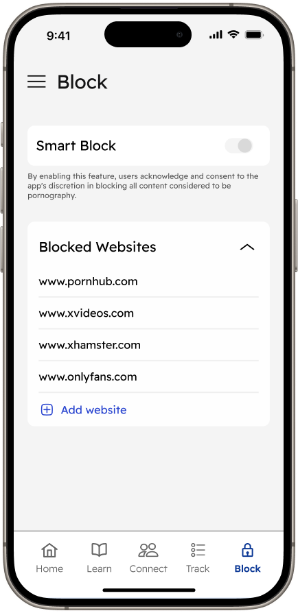
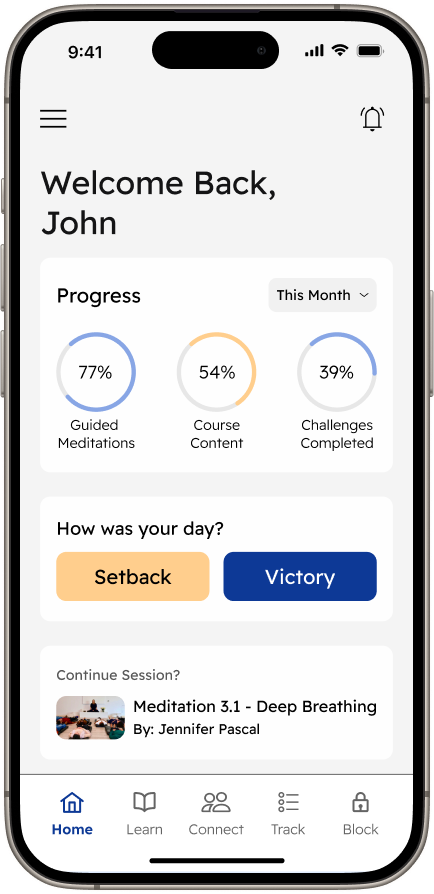
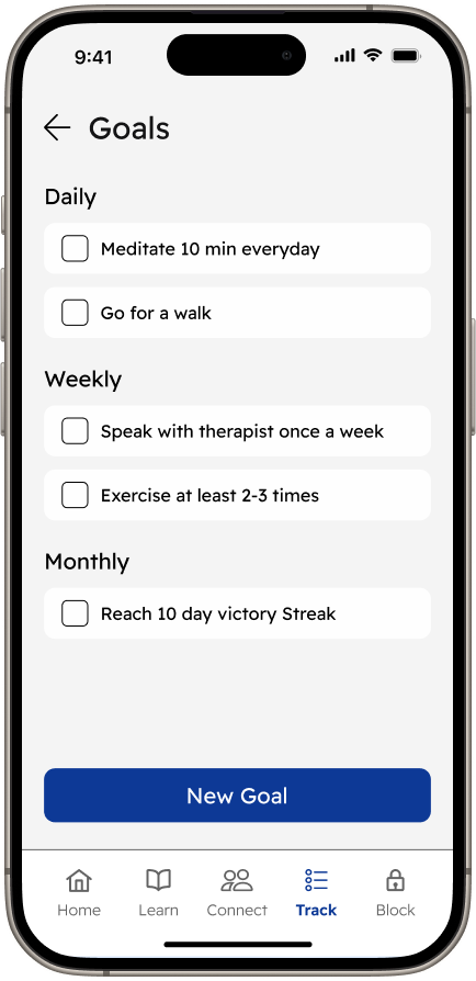
The creation of the high-fidelity wireframe screens was split between designers; my tasks included developing the Tracking Screen and the Victory and Setback modules. When designing the calendar, I added color to the previous dates to show recorded victories and setbacks and replaced the pie chart on the home screen with percent complete circles to increase scannability. As a team, we collectively created components and updated the style guide to ensure consistency throughout all screens.
The Final Product
Hi-Fidelity Screens
Developer Handoff
The developer handoff included measurements and annotations of all the high-fidelity screens. We created this file to communicate our design intentions and specifications to the developer to facilitate a seamless transition into Najaa's developmental phase.
Measurements and Annotations

Screenshot of Developer Handoff
Reflection
Working on this project provided me with the opportunity to improve my patience, discipline, and communication skills. Designing with individuals who reside in different time zones was a challenge. When scheduling meetings and hitting deadlines I had to hold myself and my team accountable for where we were succeeding and where we were not. Using my interpersonal skills was key to ensuring that the communication between myself and my co-designers was encouraging, supportive, direct, and easy to comprehend.
Throughout the process of creating the wireframes, we encountered several opportunities for improvement. Collaboration in resolving design challenges brought diverse viewpoints, which allowed us to explore different perspectives and iterate for the best possible outcome. While multiple redesigns of specific components or screens occurred, it enabled us to fine-tune our work and focus on delivering a well-rounded product. These experiences, though requiring additional effort, contributed to a more comprehensive and refined design, ultimately enhancing the final result.
Conclusion