Solutions Therapy and Wellness
An informative and user-friendly site for scheduling appointments with a private practice therapist.
Role: Sole UX/UI Designer
Timeline: 2 months
Tools: Figma, WordPress, Elementor
Website: solutionstherapyandwellness.com
Overview
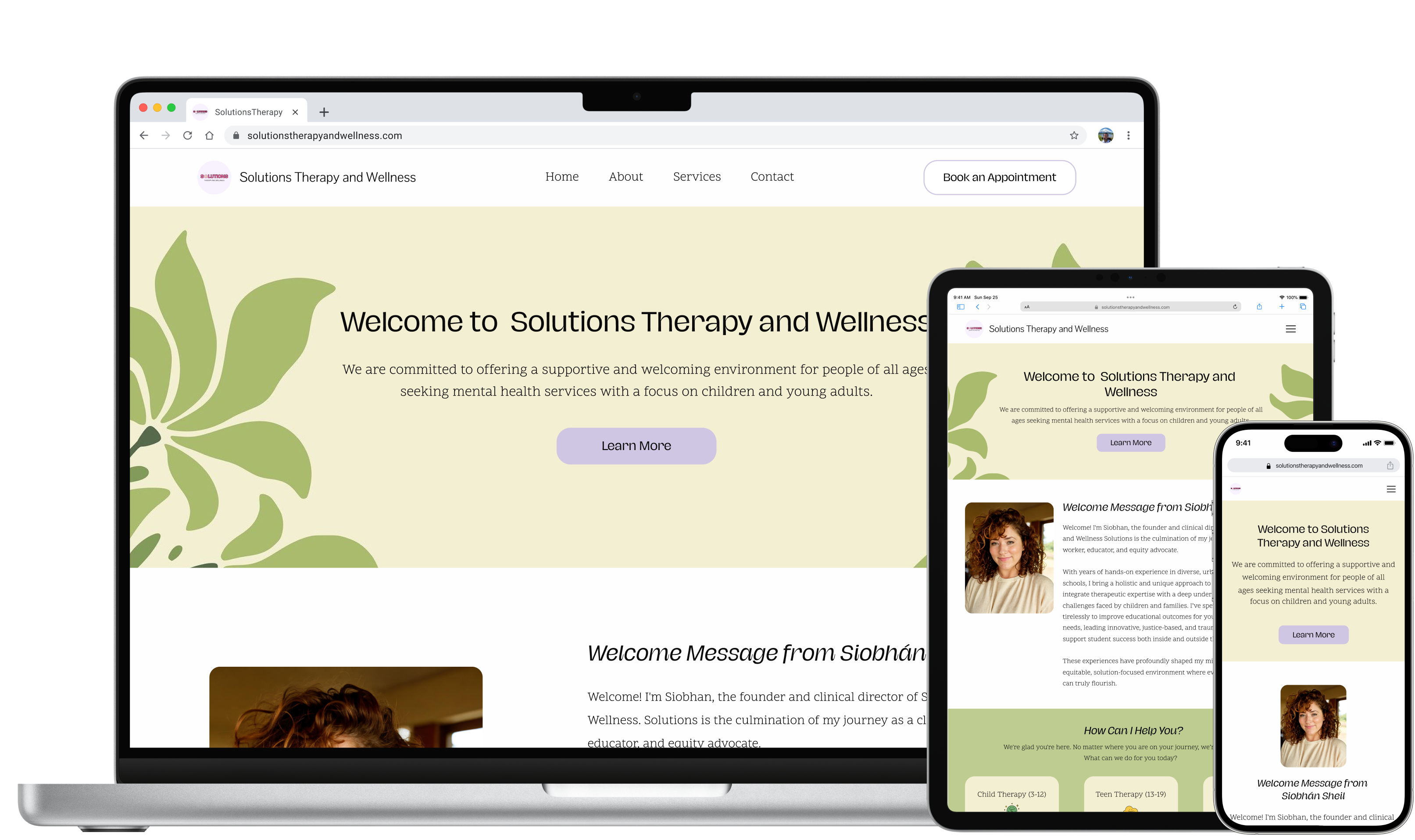
A private therapy practice website providing clientele with easy access to important information and appointment booking. While Solutions Therapy and Wellness focuses on support for children and young adults, services are available for clients of all ages.
Problem
How Can We Update The Websites Design and Flow To Improve User Accessibility?
Solution’s website was cluttered and overstimulating. The navigation and flow were poor and much of the UI failed to meet WCAG standards. Additionally, the unclear content and purpose of the site made it difficult for users to interact with.
Solution
An Updated Layout, Streamlined Navigation, and Improved User-Friendly UI.
The updated navigation and reorganization of content greatly improved the flow of the website and the revamped UI made the site more user-friendly and accessible. As a result, users can easily find information and book services, leading to increased engagement and user satisfaction.
Kickoff
Analyzing the Website's Current State
To kick off the redesign process, I examined the website to determine its purpose and target audience. Upon completing my primary analysis, I identified several issues that needed to be addressed.
- The purpose of the website was unclear
- No distinct brand presence
- Didn’t comply with WCAG standards
- There were alignment issues and broken links
Inspiration
Identifying the Essential Elements of Therapy Websites
While researching therapy websites, I identified several key features. All successful sites provided a user-friendly navigation and clear brand presence with the company name and logo on every screen. Many websites included an introduction to the therapist, building trust with potential clients, as well as clean interfaces, well-chosen typography, color schemes, and ample whitespace to provide an accessible, enjoyable user experience.
Wireframes
Streamlining Navigation and Content to Improve User Interactions
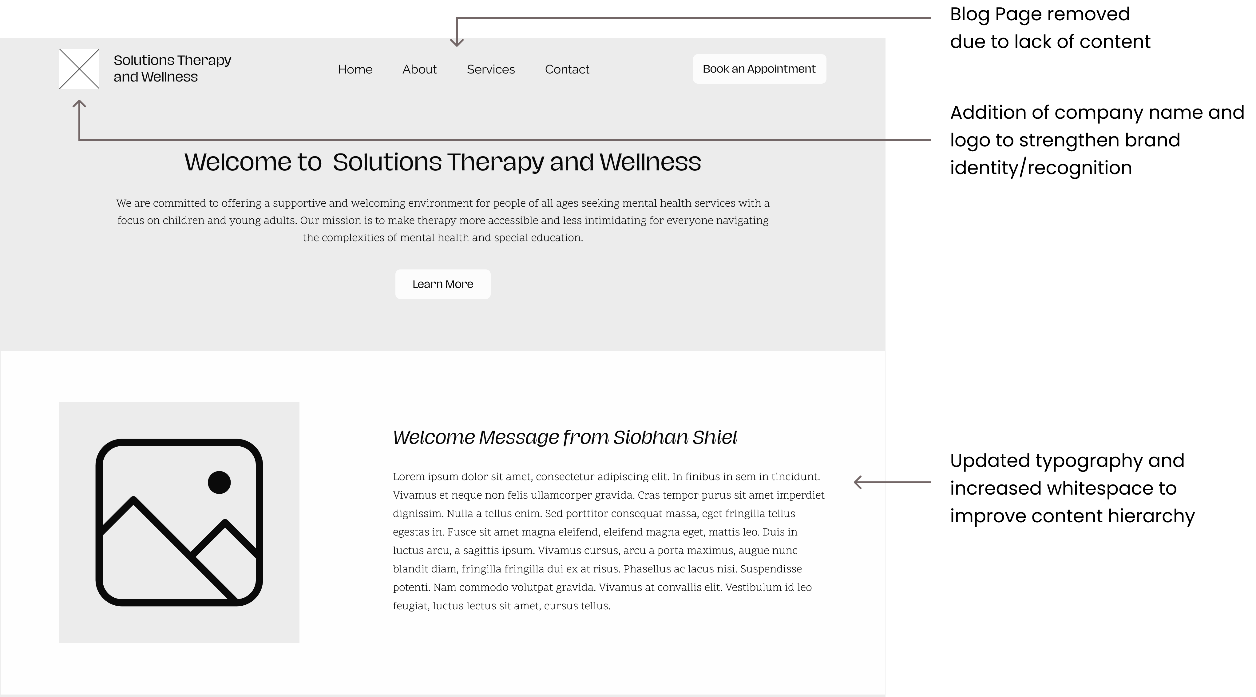
Revamped Navigation: The updated navigation is simple and user-friendly and now features the logo and company name to reinforce the brand identity
Blog Page Removal: The client and I agreed on the removal of this page due to insufficient content making the website appear unfinished
Typography and Whitespace: Updated typography and increased whitespace to clarify content hierarchy, guiding users’ attention to vital calls to action (CTAs)
High - Fidelity Screens
The Final Product
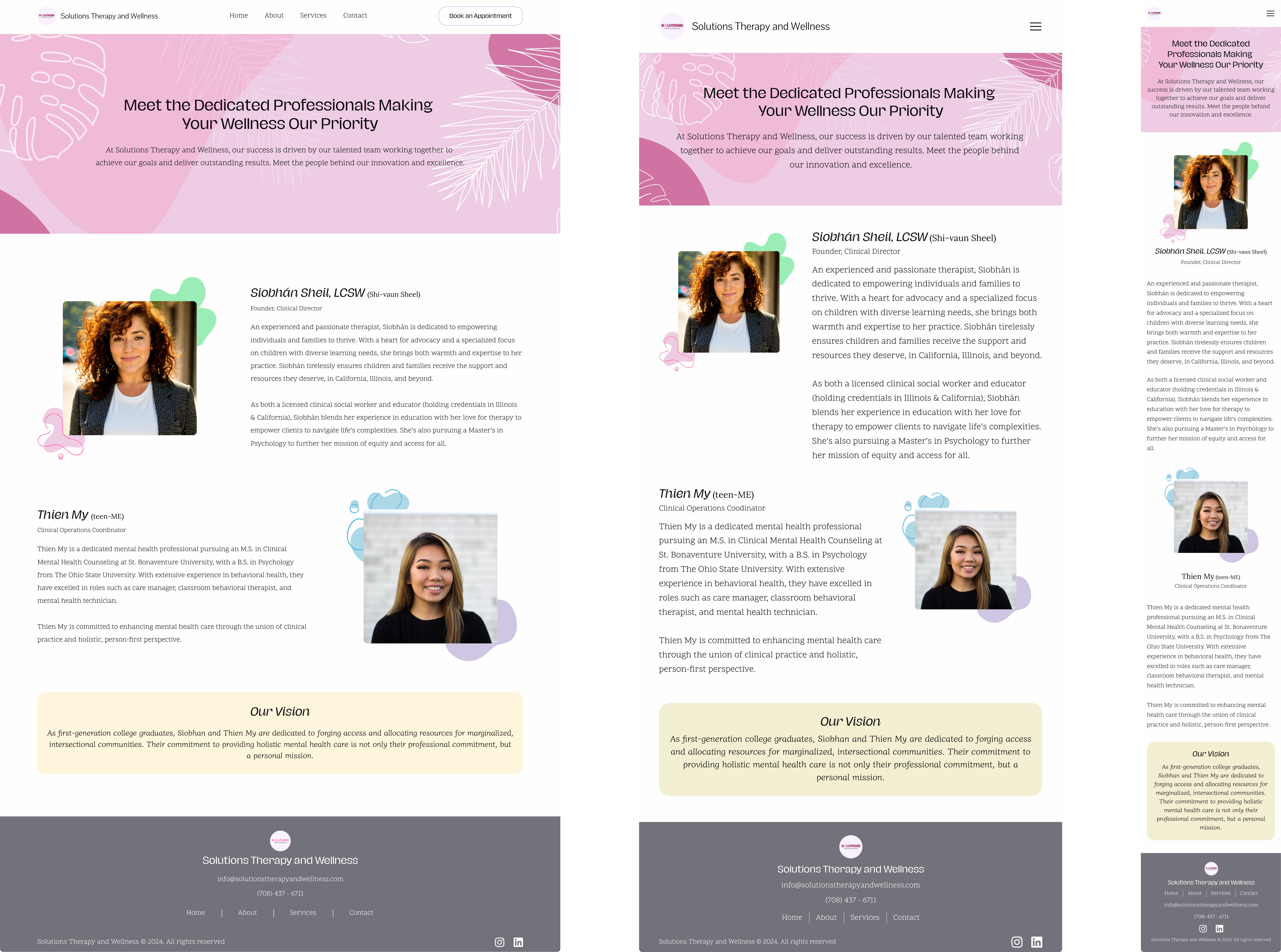
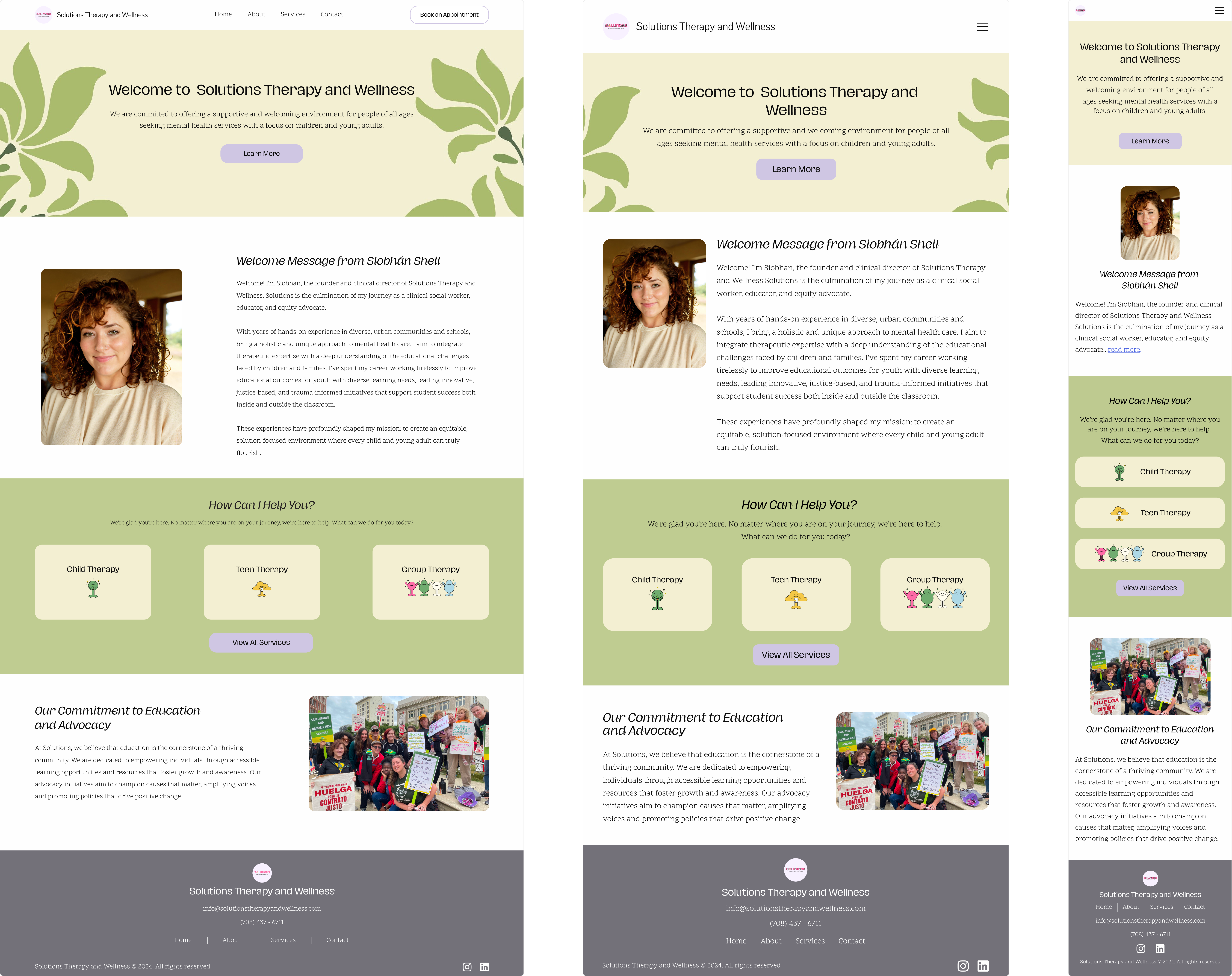
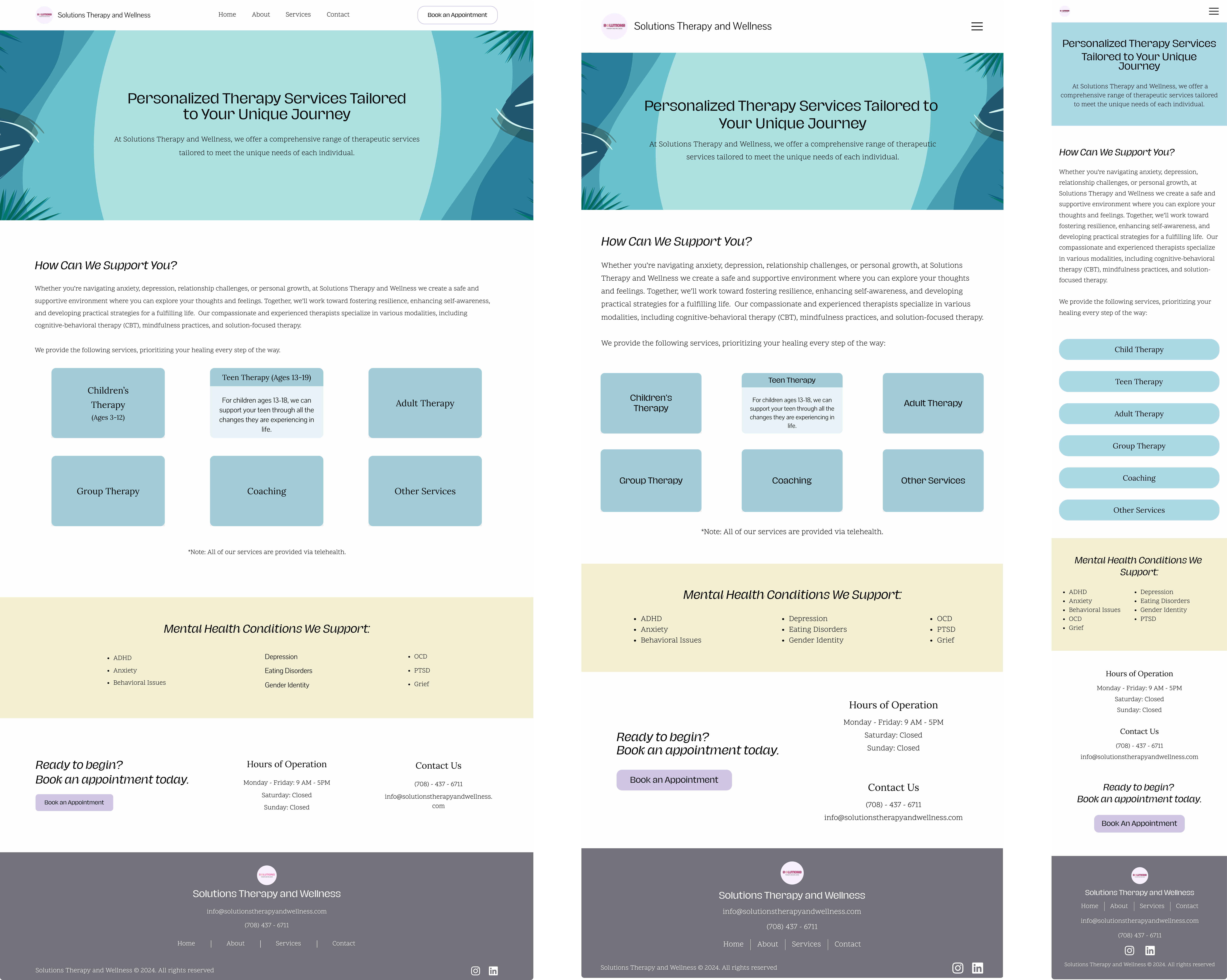
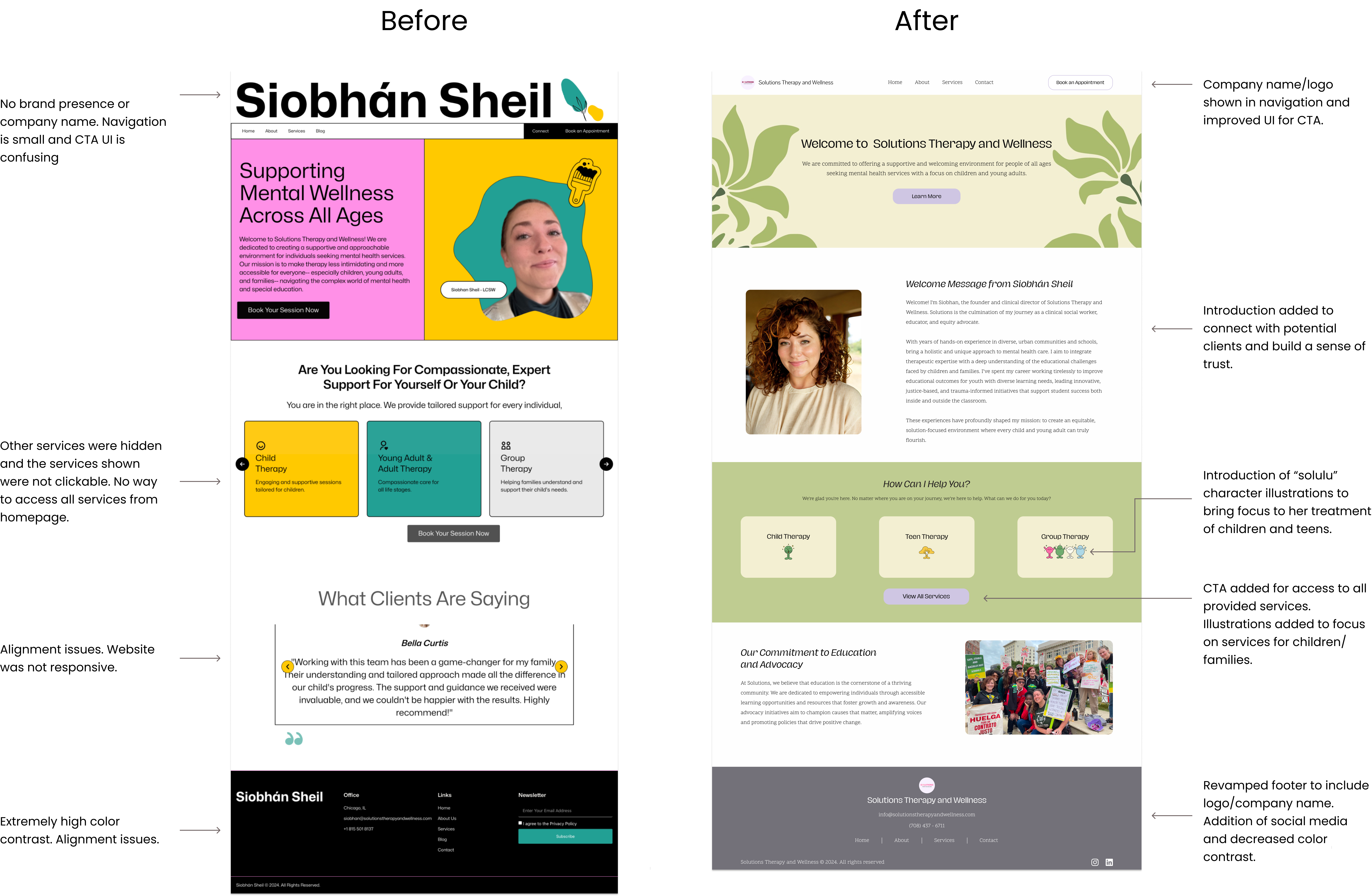
- Updated Color Palette: A refreshed color scheme that improves readability and supports brand recognition.
- Consistent Branding: The brand logo and company name are now displayed consistently across the site for better user identification.
- Increased Whitespace: More spacing throughout the design for improved readability and a cleaner, less cluttered layout.
- Playful Illustrations: Added illustrations on the homepage to reflect the brand’s focus on children, teens, and young adults.
- Revised Header/Footer: Simplified navigation for easier site exploration, and an enhanced footer for quick access to social media and contact information.
These updates combine to create a more inviting and accessible website that effectively represents the brand.
Style Guide
Designing to Complete the Brand Identity
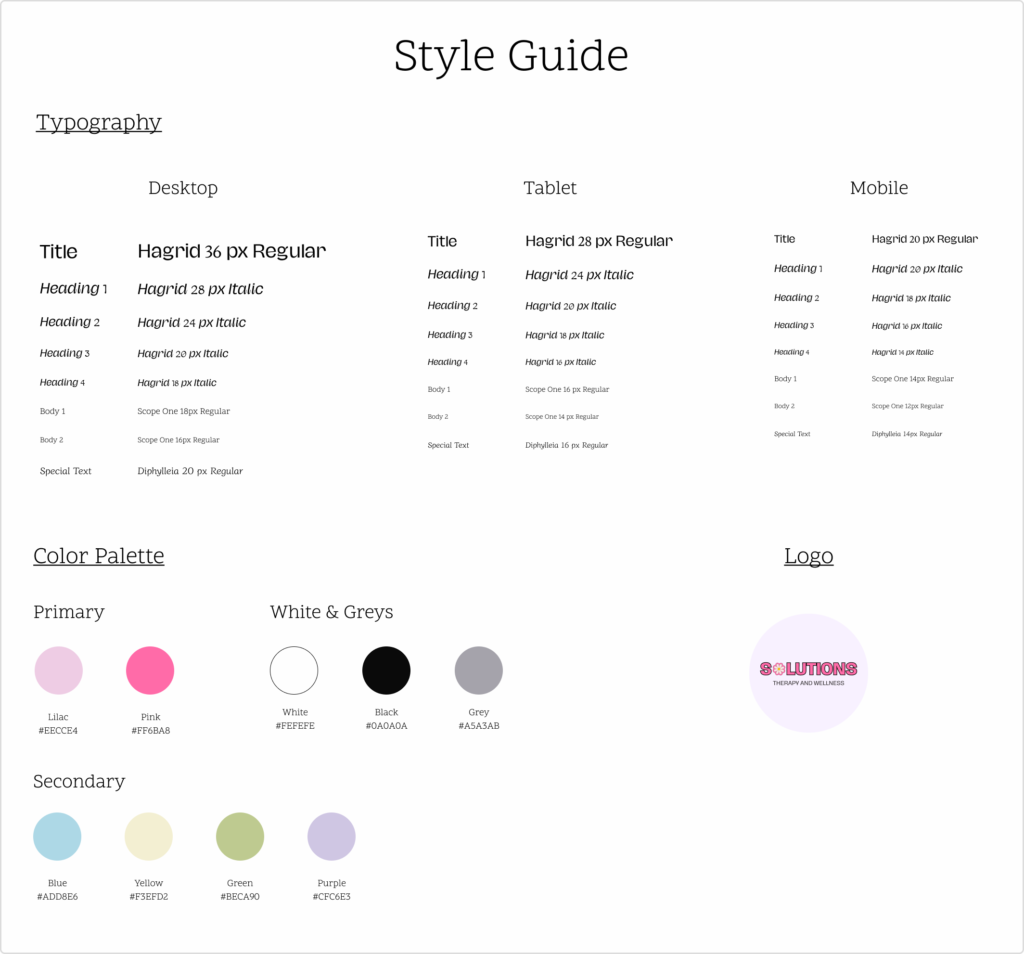
Recognizing Solutions lacked a clear brand identity, I collaborated closely with the client to create a style guide defining key elements such as the color palette and typography. The client provided the Hagrid typeface for headings and their company logo. Based on these elements, I selected Scope One for the body text, a clean and readable typeface that matches Hagrid’s fun and inviting style. I selected pastel shades of purple and blue to complement the pink in Solution’s logo, creating a sense of warmth and approachability throughout the website. By creating the style guide alongside the wireframes and high-fidelity screens I continuously updated its elements resulting in a seamless integration of the brand identity.
Conclusion
Development and Next Steps
I implemented all updates on WordPress, ensuring that my designs were seamlessly transferred to the live website. Given that Solutions Therapy and Wellness is a new business, I provided the client with the style guide, including thorough explanations of the typography, color palette, and illustrations. This allows her to maintain consistency when the time comes to expand her website and brand.
Through this experience, I learned that working over another designer’s work can be quite challenging. The lack of documentation from the previous designer made it difficult to understand design decisions, forcing me to make educated guesses and changes where I felt necessary. Additionally, transferring the designs was challenging due to missing information from the previous designer about how the site was set up. I have learned that the best approach to address these challenges is to clearly communicate with the client at the start of the project by listing any issues, explaining why they are problematic, and how I plan to resolve them. Overall, this experience enhanced my design skills and reinforced the importance of clear communication and thorough documentation.