NEXT
A B2B SaaS mobile application fostering connections between brand managers and athlete-influencers to streamline the endorsement deal process.
Role: Lead UX/UI Designer (Team of 5)
Timeline: 4 months
Tools: Figma, Slack, Google Drive
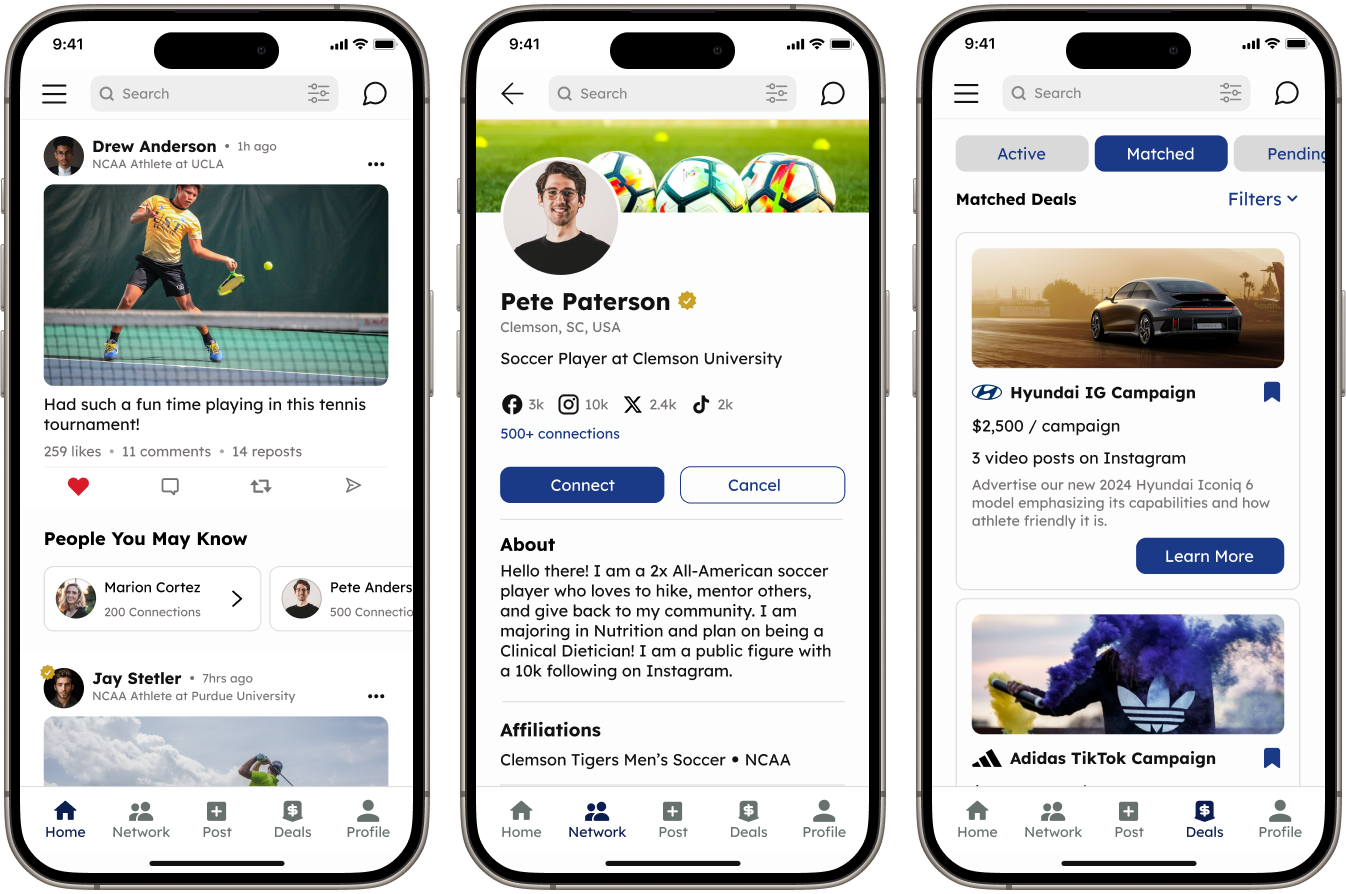
Overview
NEXT is a B2B SaaS mobile application where brand managers and athlete influencers connect to secure NIL deals. Users showcase their achievements, post updates, network, and more. Additionally, users can also track their endorsements by viewing their active, past, and prospective deals.
Problem
How Can We Reduce Cognitive Overload and Improve Flow to Enhance The User Experience?
The application’s existing designs were disorganized, overwhelming, and difficult for users to follow. The lack of hierarchy, organization, and UI inconsistencies throughout the screens prevented NEXT from achieving its goal of streamlining the NIL Deal process
Solution
Refine the User Experience Through Navigation Redesign and Content Reorganization.
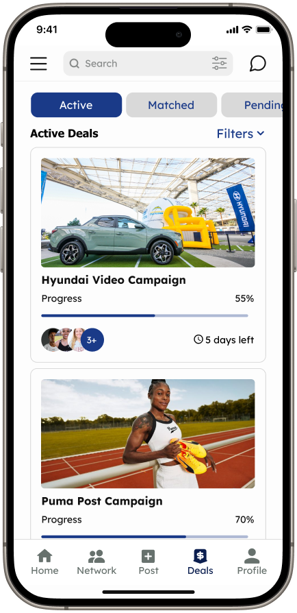
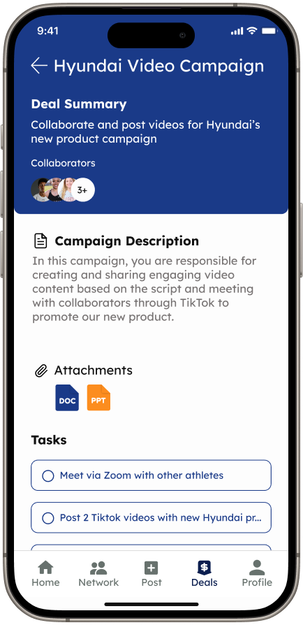
The navigation redesign and content reorganization significantly enhanced NEXT’s usability. Incorporating a hamburger menu, introducing new screens, and repositioning content will reduce users’ search time, thus improving accessibility.
Kickoff
Evaluating NEXT's Designs
The client provided us with a competitive analysis and access to the existing design system, user flows, wireframes, and mockups. An in-depth analysis brought several issues to our attention:
-
The user stories and flows were disorganized and difficult to follow
-
There were several glaring UI inconsistencies in mock-ups
-
The design system was disorganized and missing crucial elements
User Stories
Refining Client User Stories for Improved Usability Testing
The initial user stories and flows we received from the client were verbose, unclear, and disorganized. We revised them due to their incompatibility with upcoming project phases. I arranged a meeting with the client to explain that the user stories were unsuitable for prototype testing, as our team believed they would confuse participants and lead to inaccurate feedback. The initial user stories contained unnecessary details regarding the client’s preferred UI, which distracted from the primary focus of user stories – addressing user wants and needs. We revised them to prioritize users by eliminating UI specifics, enabling us to utilize the stories as tasks for participants during usability testing.


Testing
Identifying and Addressing Critical Navigation and Accessibility Issues
We developed a prototype with the existing mock-ups and then conducted 10 remote unmoderated interviews. During these sessions, participants engaged in 7 user journeys and provided feedback on design elements they found appealing or problematic. We compiled a user testing report complete with a chart categorizing design issues by severity. Some of the critical design issues were as follows:
Participants were unable to complete tasks due to the disconnect between screens
Participants were unable to access their profile or their connections
Long and confusing onboarding and walkthrough before accessing the homepage
Many tasks were left uncompleted by participants due to them becoming irritated and discouraged

Redesign
How Can We Improve Flow and Decrease User Frustration?
The results of our user testing showed that NEXT’s poor flow and navigation were causing the majority of the usability issues. Test participants were also confused by the many inconsistencies throughout the UI. Over several iterations we focused on re-organizing content, providing clear easy-to-use navigation, prioritizing information architecture, and creating consistency. Below are some of the updates made to improve accessibility and enhance the user experience.

Homescreen
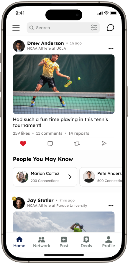
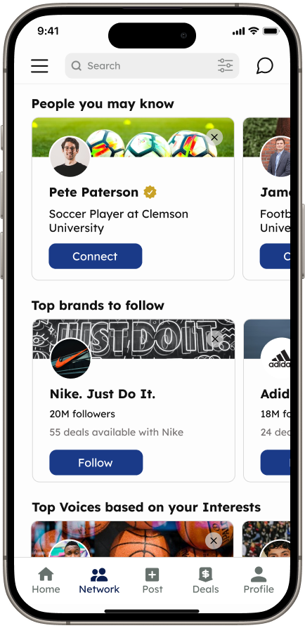
The initial home screen overwhelmed our test participants with content, leaving them uncertain about its primary purpose. To avoid cognitive overload, we redesigned the screen to resemble a social media dashboard, displaying only content relevant to their network.
Earnings and NIL Deals were moved to more suitable pages to keep the focus on the user’s network
People you may know were added to prompt users to interact and further explore the application
The size of the brand cards was reduced to improve information hierarchy
Navigation
A simple redesign of NEXT’s navigation was the solution to many of the issues brought up by our test participants. These two changes allow users to navigate the application with ease.
A hamburger menu was added to provide users with easy access to additional navigation
Participants struggled to access their profile so we redesigned the bottom navigation to remove any difficulty or confusion.

Design System
Organizing and Updating NEXT’s Design System
Throughout the redesign phase, our team maintained NEXT’s design system specifically our team modified the typeface replaced mismatched icons, and redesigned components to improve the user experience. During a meeting with the client and design team, we addressed the need to update components utilized for displaying user deals. The UI across these screens lacked consistency, with some components being overly text-heavy while others relied on imagery to display information. Collaborating closely with my team, we integrated brand icons and imagery to maintain a consistent UI and improve readability.

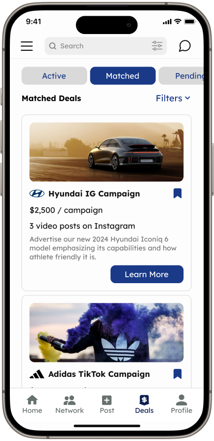
Redesign of Matched Deal Component

Redesign of Pending Deal Component

High - Fidelity Screens
The Final Product
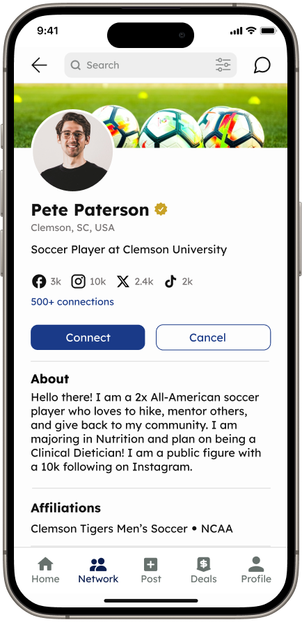
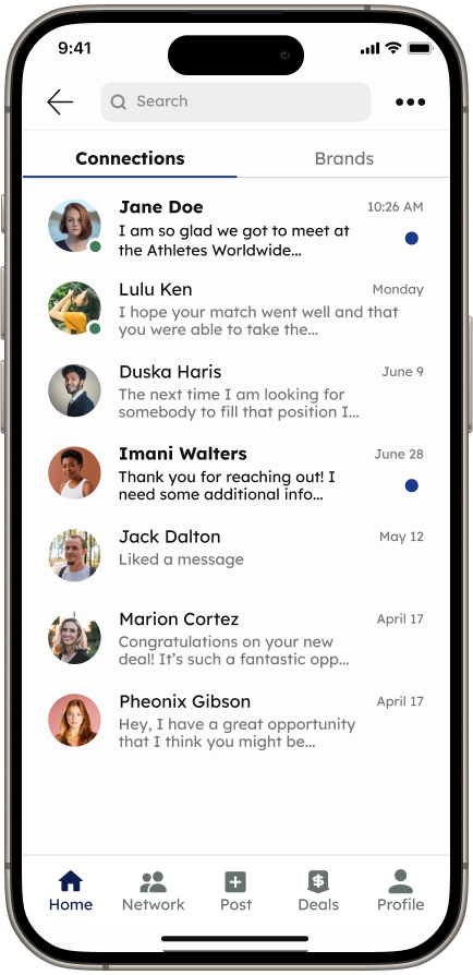
Each designer was allocated an issue from the usability testing chart to initiate design updates. We held regular meetings on Figma to collaborate on creating components, updating iconography, and conducting peer reviews. I redesigned the components on the Active, Matched, Pending, and Past deals screens to achieve a more unified UI. I also worked alongside my co-designers to revamp the Messaging screen focusing on cleaner visuals and improved spacing for better usability. After multiple iterations, the updates are as follows:
Enhanced the information architecture and UI consistency across all screens through the redesign of CTA components and updates of iconography
Reduced visual clutter and confusion with the addition of new screens and the reorganization of content
Enhanced flow by incorporating a hamburger menu and Profile Icon into the bottom navigation


Developer Handoff
Measurements and Annotations
I collaborated with my team to prepare a Figma file that included detailed measurements and annotations of all screens. In the annotations, we clarified flow, navigation, and our design decisions to prevent confusion and provide developers with the information necessary to develop the screens as intended.
Reflection
Key Takeaways and Lessons Learned
Leading the design team at NEXT and collaborating closely with the client and stakeholders was challenging and fulfilling. Assigning tasks and coordinating with team members across various time zones proved difficult at times. However, I embraced this challenge as an opportunity to utilize and further develop my leadership and agile abilities. Leveraging my time management, organization, and critical thinking skills allowed me to successfully manage my team and deliver high-quality work under strict deadlines. My communication skills were tested when advocating for the team’s design decisions, especially when the client expressed strong opinions on certain UI aspects that compromised user accessibility. With the help of my co-designers, I successfully defended our decision with research-backed explanations. In conclusion, working on this application has been extremely educational and provided valuable experience that enhanced my skills as a designer.