A B2C mobile application that allows users to join a group of individuals with a shared goal to monitor each others’ progress
Role: Lead UX/UI Designer
Timeline: 6 months
Tools: Figma, Miro, Slack, Google Drive
Website: circlez-online.com
“Ettienne worked with my software company in our earliest stages. Her designs were not only elegant and intuitive, but played a crucial role in building out our platform. She was a pleasure to work with, and always welcomed feedback. I highly recommend her for any of your software design needs.”
– Aiden Tahmazian, COO & Co-Founder, Circlez, Inc.
Overview
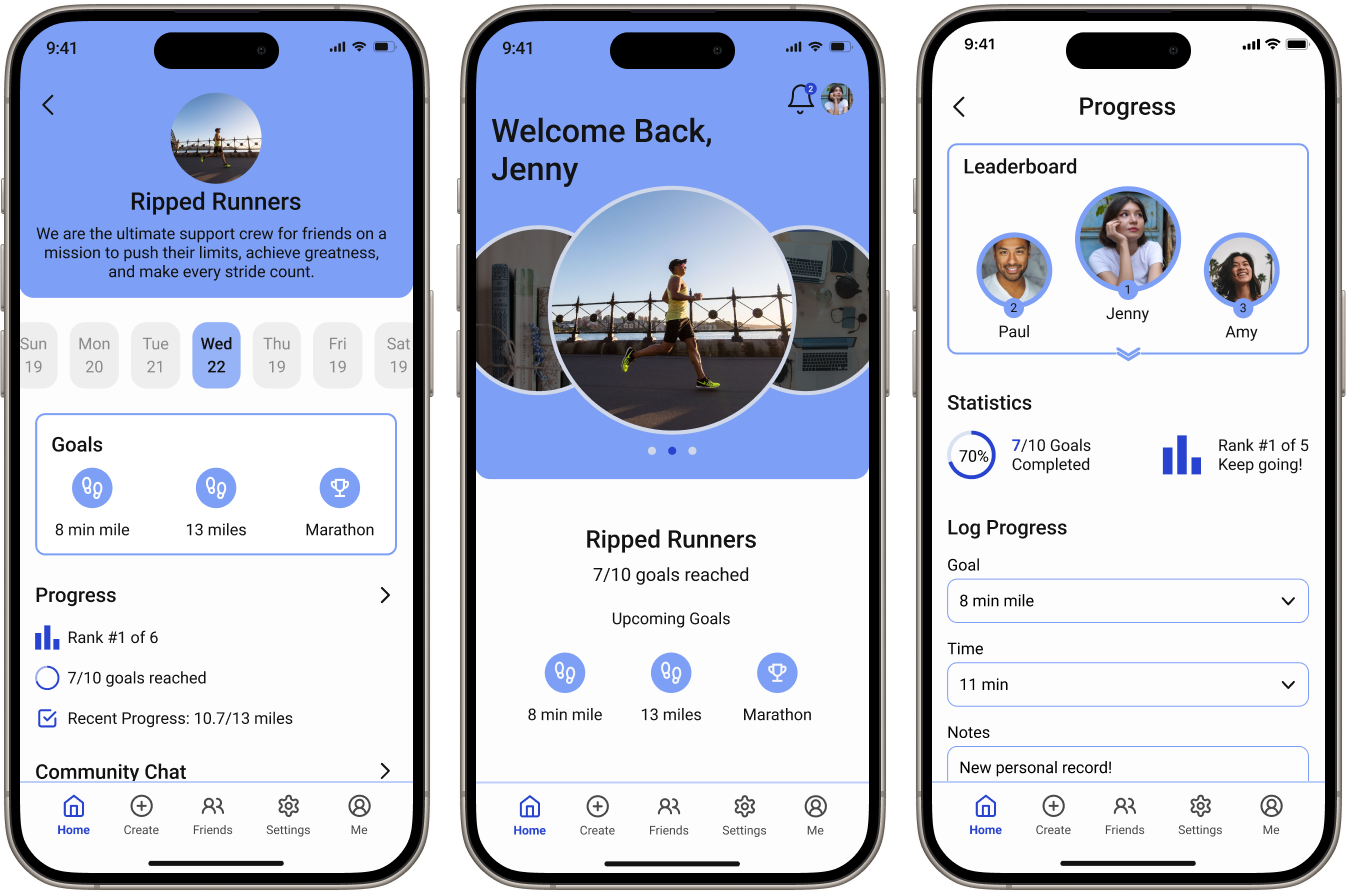
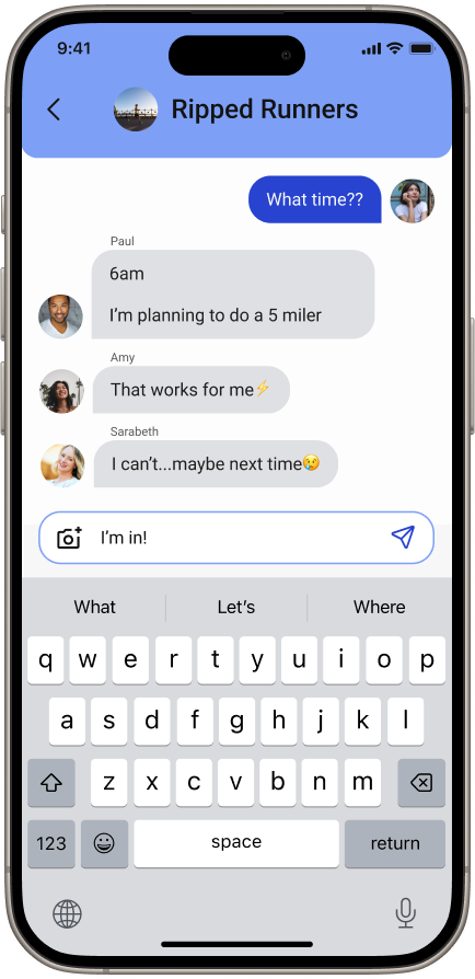
Circlez is a B2C mobile application made to assist users with keeping track of their goals. Users have the option to join a group of individuals to work towards a shared goal or create one themselves. Within these groups, users can chat with other members, log progress, create new goals, and motivate other members to stay on track.
Problem
92% of People Give Up On Their Personal Goals.
Many people struggle to find the discipline needed to accomplish their goals. It can be challenging to locate others with similar goals to provide motivation and monitor progress. The client requested a user-friendly application providing a space for groups of individuals to communicate and collectively log progress toward common goals.
Solution
A Mobile App Connecting Individuals with Similar Goals for Mutual Accountability.
Circlez offers a platform for users to connect with individuals to track progress, set goals, and hold each other accountable. Our team prioritized user needs, incorporated gamification, and drew inspiration from successful tracking applications to meet client expectations and user needs.
Kickoff
Preparing a Client Questionnaire and Gathering Additional Information
The client sought a mobile app with a user-friendly interface featuring circular design elements and gamification to enhance user engagement. The client provided the logo, concept sketches, and an introductory video outlining design expectations. Upon reviewing the provided materials my team and I formulated a list of questions for the client to collect additional information before beginning our design process. The main takeaways from the client’s response were as follows:
- Use logo colors for primary colors and use UI best practices for typography.
- Flexible with design as long as we prioritized a circular UI and gamification.
- The creator of a circle controls access to the circle and all editing features.
User Flows
Focusing on User Needs to Craft Accessible User Flows
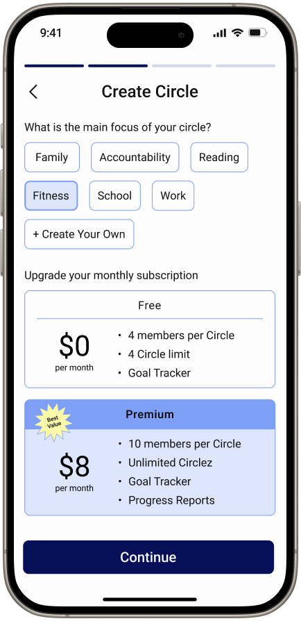
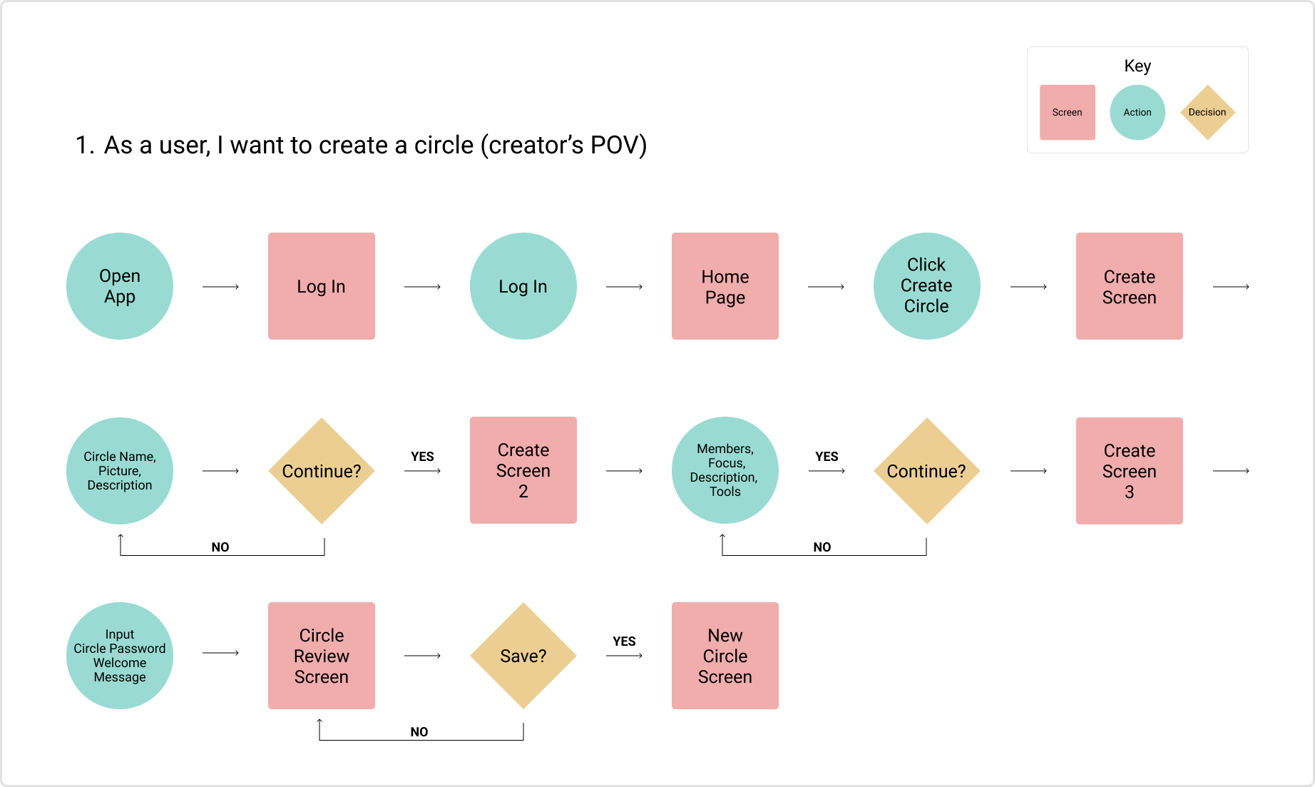
Referencing our user research and the sketches provided by the client, my team and I created 7 user stories and corresponding flows. I was responsible for crafting flows for user stories 1 and 2. While crafting the user flow for “create a circle,” I did the following:
- Reduced onboarding screens by 50% to by consolidating enhance user experience and minimize frustration.
- Reduced number of inputs by collecting only the information necesary for circle creation.
- Decreased Time-On-Task to encourage users to complete the Circle creation process..
Wireframes
Incorporating Gamification and a Circular UI to Keep Users Engaged
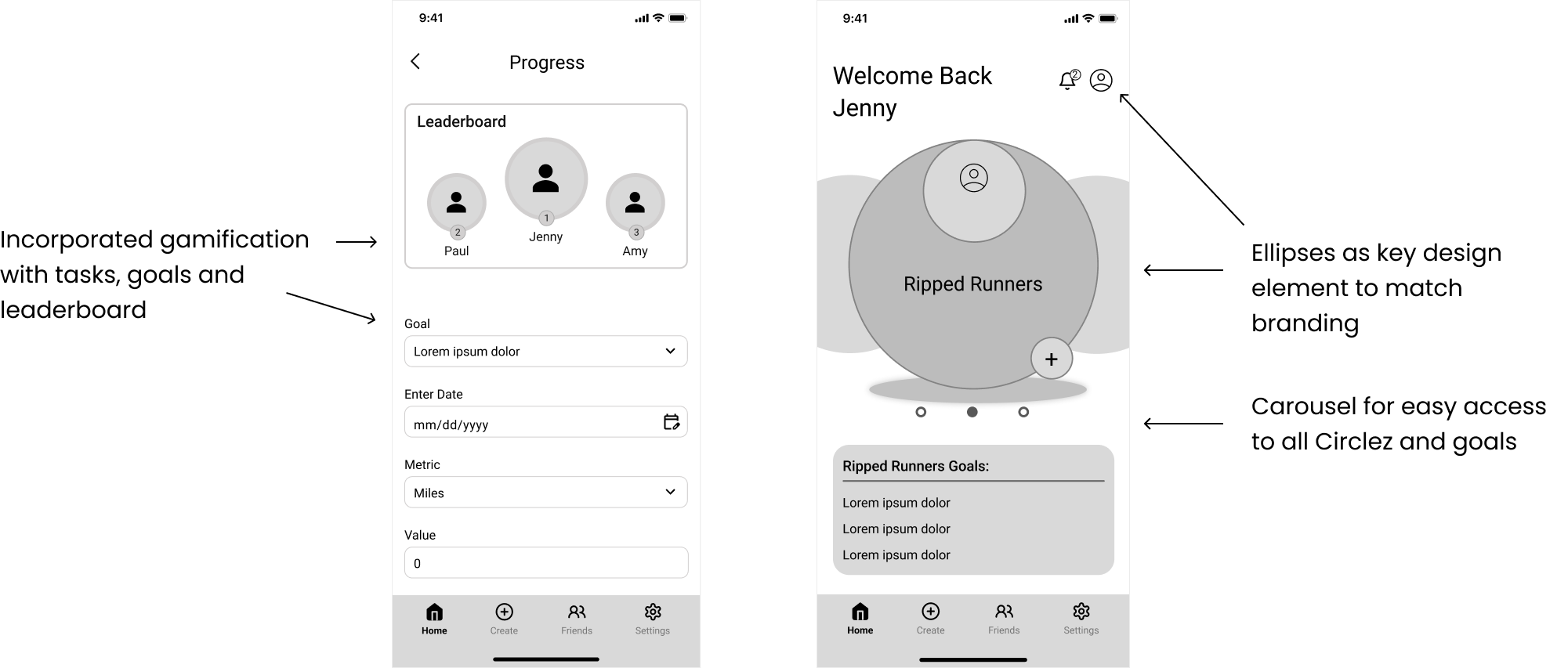
Each designer created the wireframes corresponding to the screens in their designated user flows. I was responsible for “create circle” screens (user flow 1) and during this process, I took my inspiration from the onboarding process for video games. My research showed a quick straightforward process that only required the most important information was best. I also removed the bottom navigation to not distract the user from completing the circle creation. Key elements in our wireframe design:
- We incorporated ellipses into the wireframes to give the UI a fun and playful feel.
- We incorporated gamification by including tasks, goals, and a leaderboard to encourage friendly competition.
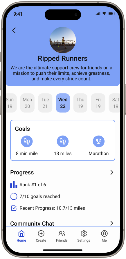
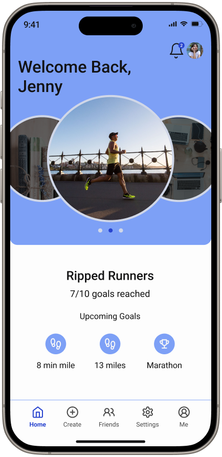
- The team designed the home screen to include a carousel and brief overview of all their active groups, to ensure the users had easy access to all pertinent information.
Inspiration
How Do We Best Incorporate Ellipses Into Our Design?
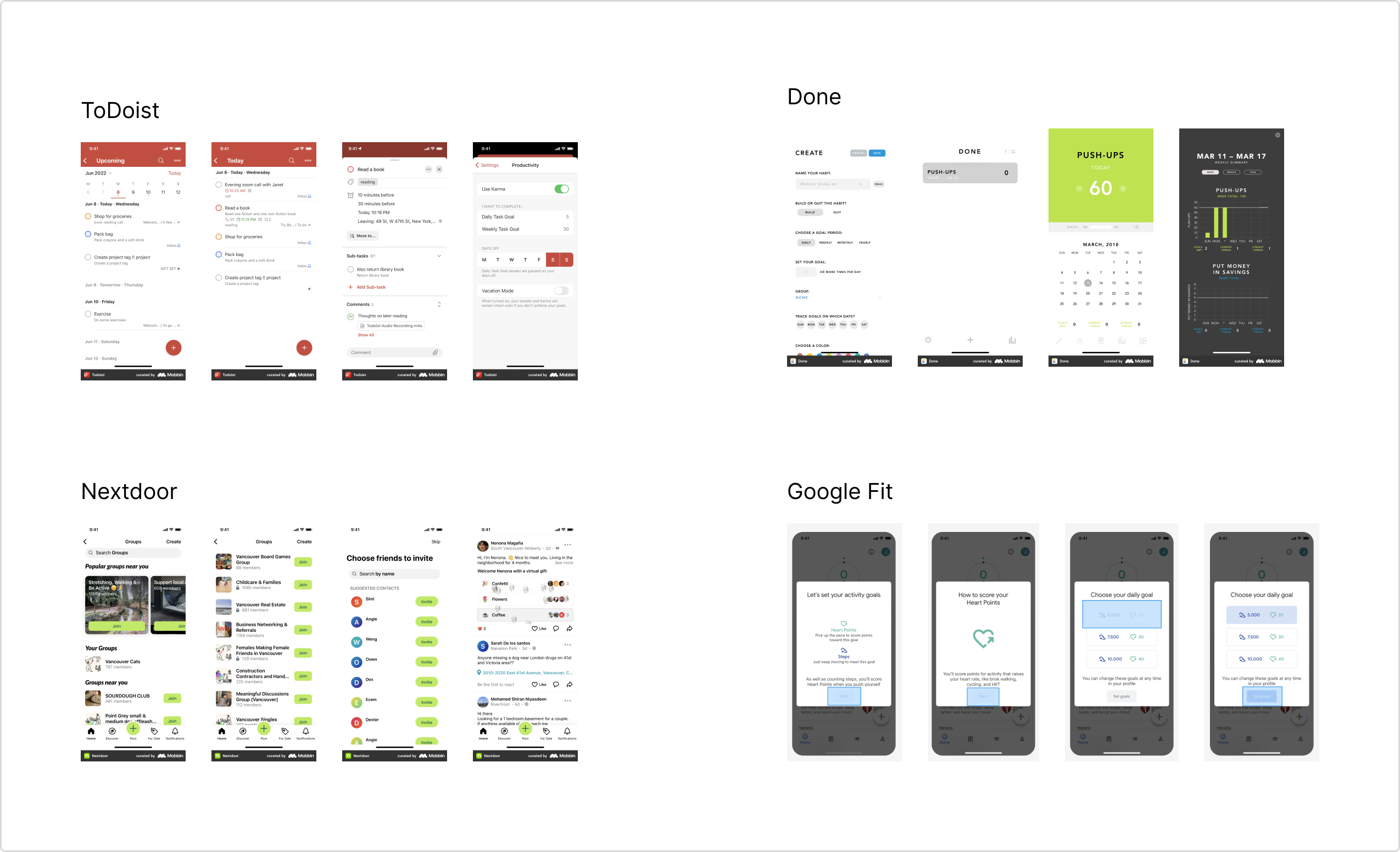
My team and I compiled images from several applications to look for design inspiration for our high-fidelity wireframes. We chose goal, tracking, and messaging applications that displayed a circular UI design because they aligned closely with our client’s expectations. Examining the layouts of these mobile applications provided information on the current trends of the design elements we planned to incorporate in our future designs. Our findings were as follows:
- Circles were often incorporated into the navigation, profile images, and bullet lists.
- Tracking applications provided a calendar, a list of goals, and progress bars.
- When creating a new goal, users were given lots of freedom to choose titles, images, input values, etc.
UI Iterations
Prepraing Homescreen Iterations for Client Selection
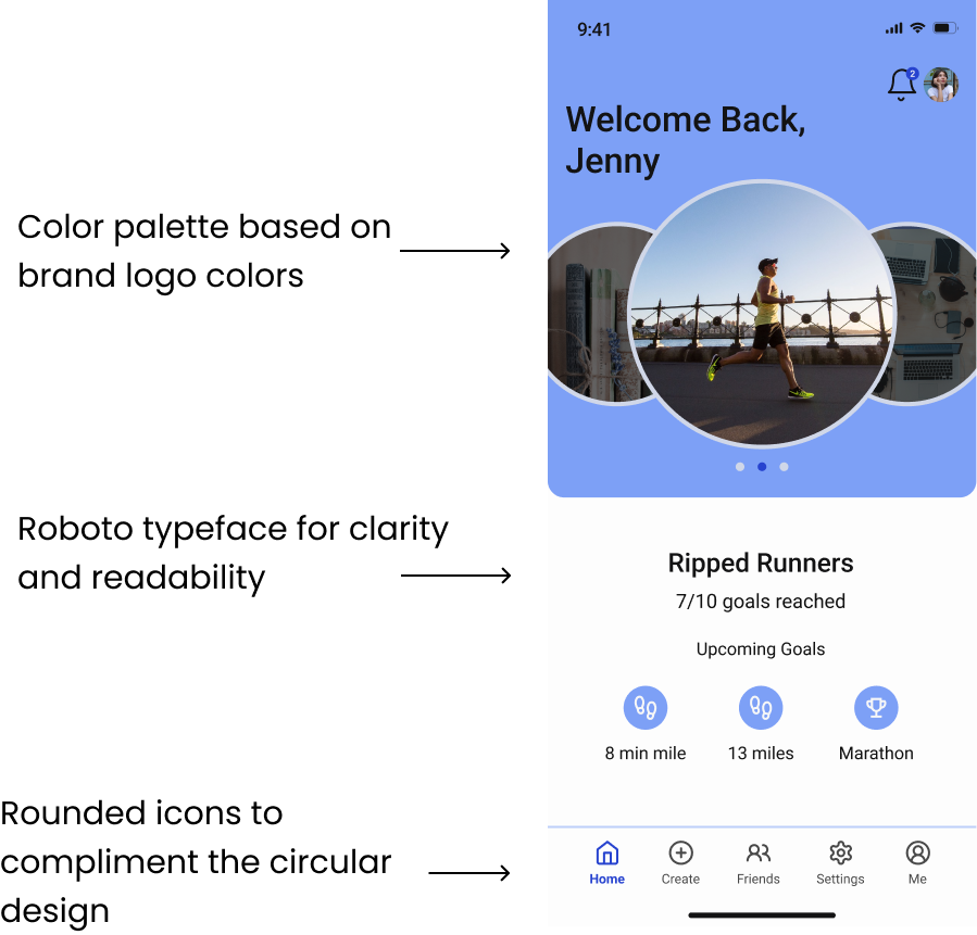
My teammates and I each created a version of the home screen using various colors and typography. While all three designs displayed similar information we aimed to offer the client various color palettes and typography options, as those design elements were not specified. At the client’s request, I based the color palette for my home screen design on the brand’s logo using the lighter blue for backgrounds and strokes and the navy blue for CTA’s. My iteration was selected from among the four options, and we structured our subsequent hi-fidelity screens around it.
Design System
Finalizing Style Guide and Building Out Design System
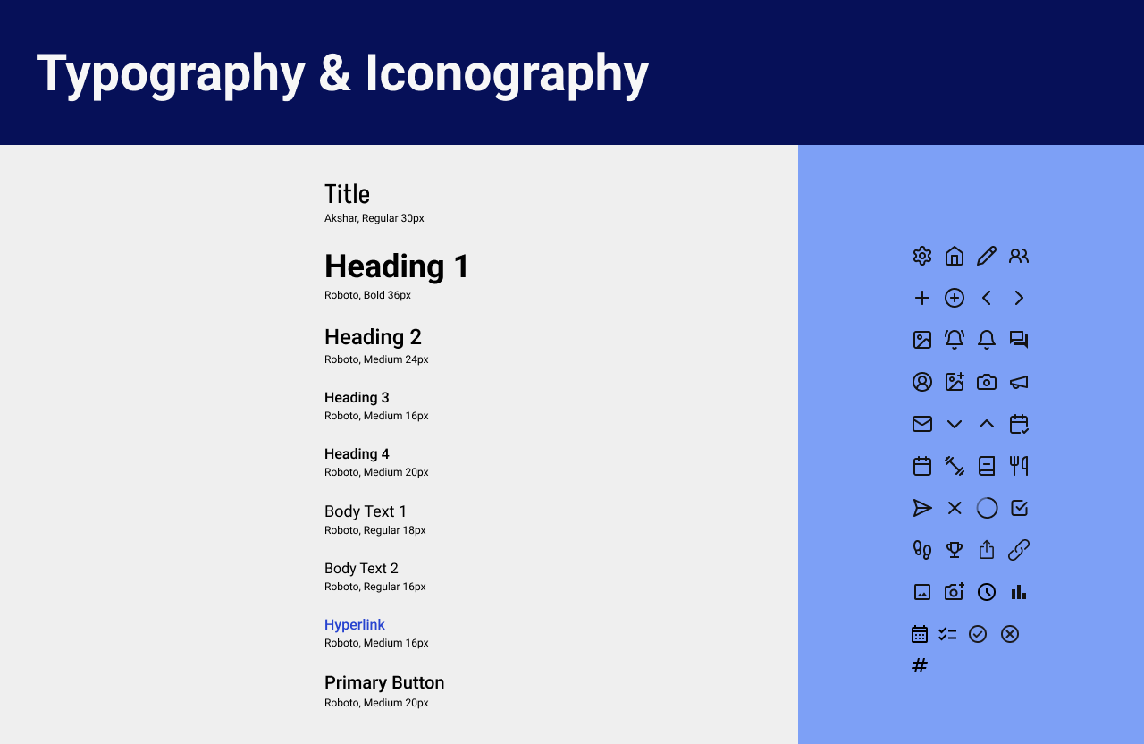
During the process of designing our high-fidelity wireframes, we created Circlez’s design system. At the client’s request, we matched the primary colors to the Circlez logo, and after multiple iterations and team meetings we finalized our secondary colors and typography. The iconography was chosen to include circles and round edges to match the circular design of the home screen. Once these decisions were finalized we updated the style guide and added the master components to build Circlez’s design system.
High - Fidelity Screens
The Final Product
Referencing my home screen my team and I built the remaining screens. Following multiple meetings with the client and several iterations, the final high-fidelity included the following updates:
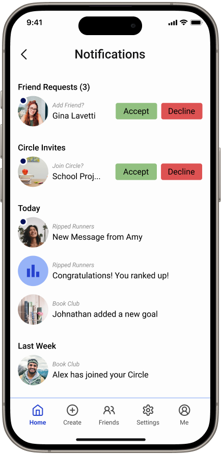
- The Notification screen had a more circular design.
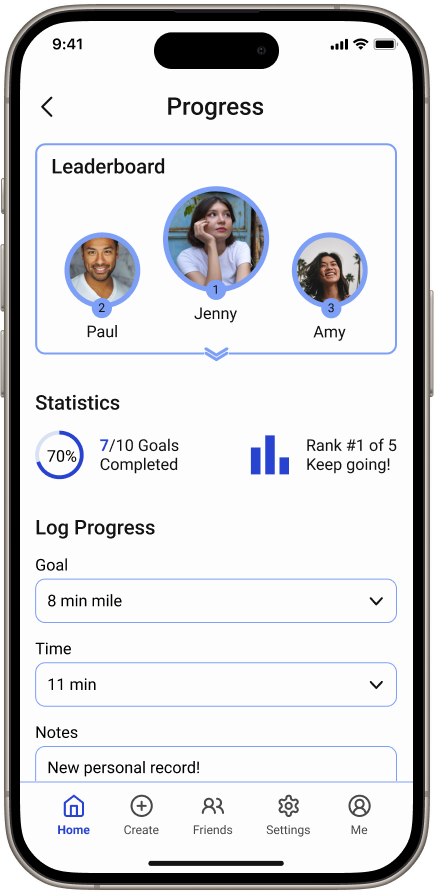
- The progress screen included the leaderboard and progress inputs for users.
- “Me” was added to the bottom navigation for access to user profile.
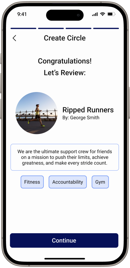
- The option to upgrade to a Premium Plan was added to the process of creating a circle.
The updates to the Log Progress screen improved the user’s accessibility by lessening clicks needed to update their progress. When creating a circle, I added an option for users to upgrade to premium to provide easy access for users who may decide to upgrade. Before moving forward with our developer handoff, all designers attended a Zoom meeting to review all screens for consistency, flow, proper iconography, and text styles.


Developer Handoff
Measurements and Annotations
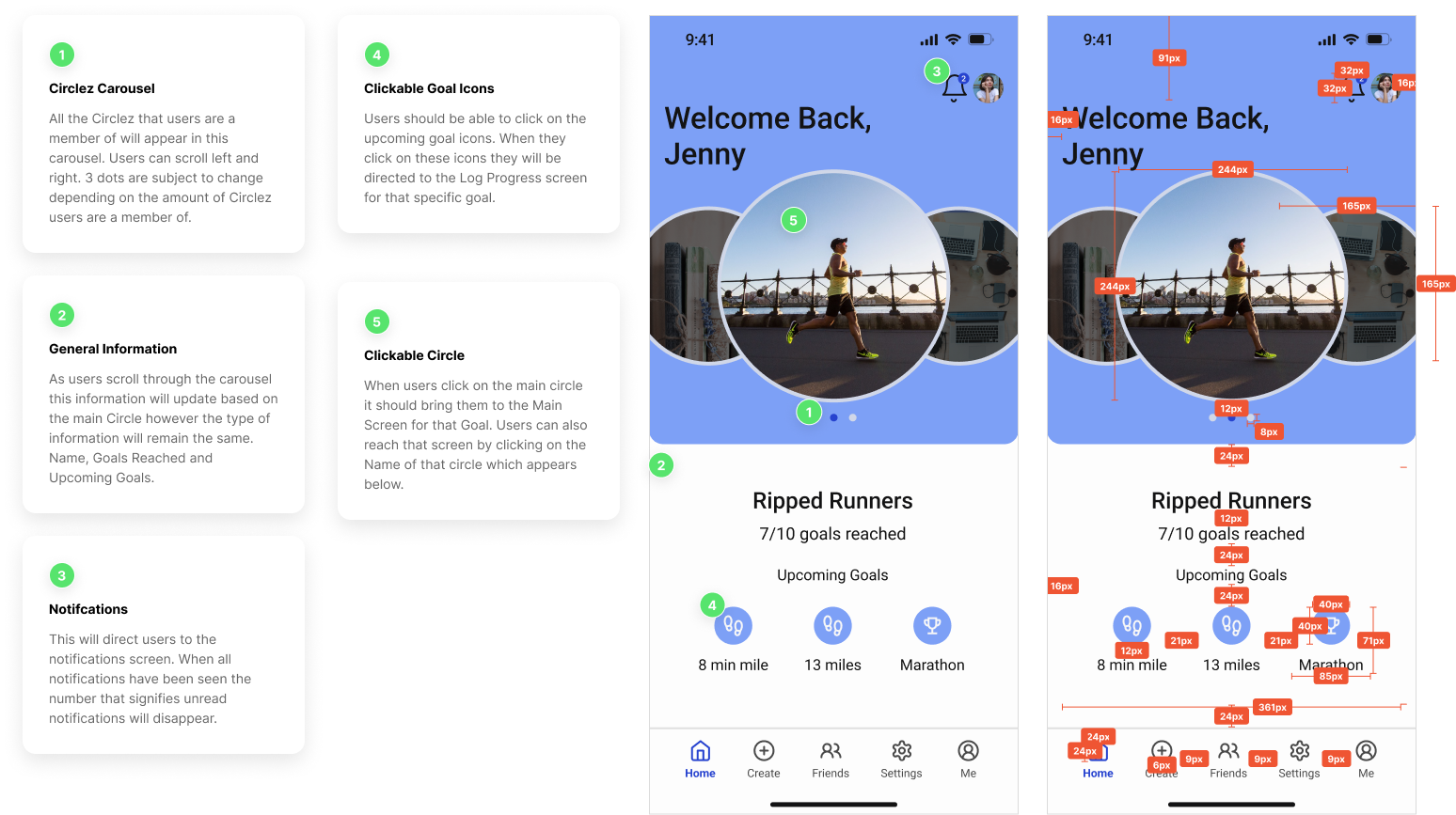
For the developer handoff, my team and I added notes to explain certain functions of the application as well as measurements of every high-fidelity screen. We provided the client with this file to share with Circlez’s developers in order to provide them with the information needed to ensure they are able to build the designs to function as intended.
Reflection
Key Takeaways and Lessons Learned
Operating as the lead designer for Circlez LLC challenged and educated me in many different ways. As the lead designer for this project, I was responsible for many tasks including client communication, interdepartmental collaboration, and overseeing deliverable schedules. I was able to manage all of my responsibilities by leveraging my time management and organization skills, but this experience also taught me the importance of delegating and reaching out to my co-designers for support. I learned the key to being a good leader is acknowledging my co-worker’s individual strengths and providing them with the opportunity to do what they’re best at.
Another obstacle I faced during this project was navigating differences in opinion when it came to our high-fidelity iterations. As designers it is expected to have varying perspectives however these differences delayed our progress and risked our deadline. I requested my team to clearly and respectfully provide thorough explanations behind their design decisions This provided us with a deeper understanding of each other’s views and enabled us to effectively collaborate on the final iteration.